Kevin Spence Architect
An updated brand identity, and a new website for an architect who makes beautiful work in the PNW.
My Role:
Lead Designer responsible for brand development, and UI / UX.
Company:
Chalkbox Creative
Key Responsibilities:
-
Brand development
-
Audience research
-
User journey and wireframe development
-
Prototype creation and testing
-
Stakeholder presentations and collaboration facilitation
-
Asset delivery and launch
The challenge
Kevin Spence | Architect (KSA) provides thoughtful, tailored design solutions by working to gain a deep understanding of each client's needs, desires, and style. He builds lasting relationships in addition to architectural work that stands the test of time.
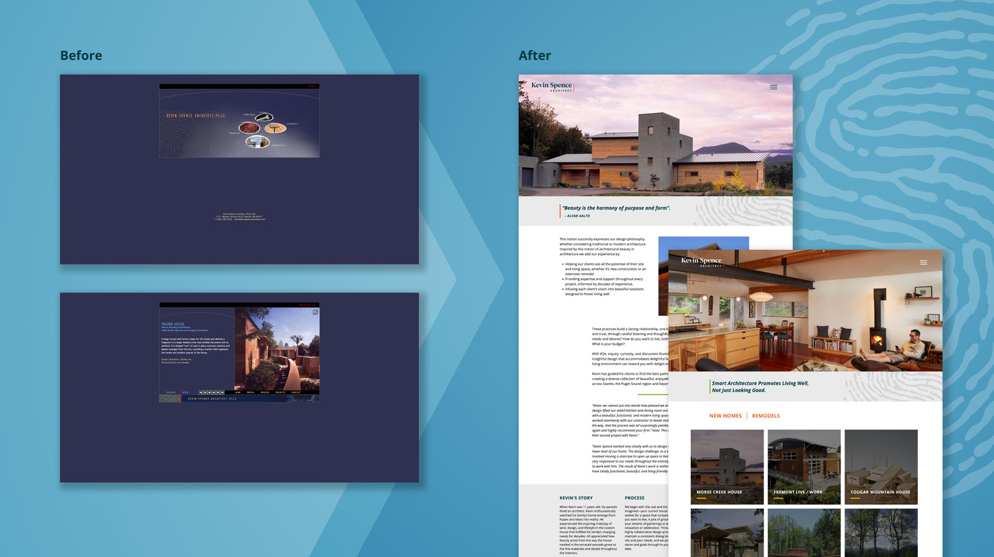
When KSA approached my team at Chalkbox, their firm was nearing a 20-year anniversary and needed to elevate their brand, and redesign their website. The high quality, sustainable, and personal approach KSA takes with each project needed to show through the brand, and this work needed to be showcased beautifully online. KSA's website had not been addressed in quite some time, and was out of alignment with the quality of work they produce.

A personal touch with careful consideration.
KSA has three primary audiences: homeowners interested in sustainable living, contractors and consultants, and skilled architects who might fit as potential employees. We needed to make something that felt appropriate to each audience, and communicates KSA's focus on a personal approach, sustainability, and high design.

An approachable, design forward physical touch-point.
KSA didn't require printed assets aside from a business card as part of their new brand launch. Still, we took this opportunity to make something that made use of the new brand components, aligned with their newly defined brand voice, and that KSA would feel proud to hand out.

Building from the past, designing the future.
It had been quite some time since KSA had last updated their website. What they had in place previously was not optimized for modern devices, and didn't emphasize the work KSA does. We were excited at the opportunity to step KSA's web presence into the future.

A simple structure
and objective.
The user flow and funneling for KSA's new site was not complex. There are three areas that KSA wanted to direct his audience towards; his story, his process, and his projects. We made sure this was easily achieved in as few clicks as possible, all while showcasing the beautiful work the firm produces.

A project forward, sleek, branded experience.
The resulting site puts great emphasis on KSA's work, utilizing beautiful full width images, plenty of white space, with hints of that fingerprint texture brand component. The result is a site that is much easier to navigate, emphasizes KSA's expertise, and finally provides the firm with a contemporary web presence.
Key take-away and lessons learned.
This project was a satisfying one to complete. Collaborating with KSA's team to step their brand and web presence out of the 90s and into the future, into alignment with the stunning architectural work they create, was a joy. The process was longer than anticipated due to KSA's busy schedule, and while that presented some challenges to the creative team, we were able to keep the project narrative flowing and successfully complete the work. This was achieved with thorough documentation, and effective collaboration between my team at Chalkbox and KSA's team. It was an affirming process lesson that helped us not lose momentum as the schedule evolved.

